

Blogs

Date 29 June 2026
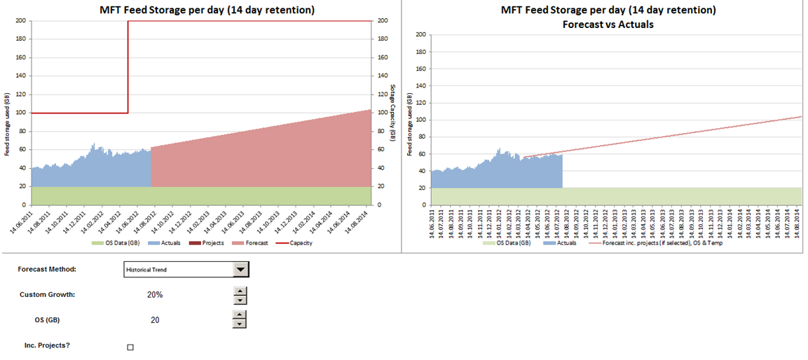
In the previous three parts of this blog series we have developed a forecast of file storage size and implemented some parameters to allow the end user to adjust the forecast (such as adding additional growth to the forecast or assigning some storage to the operating system). In this final part, we’ll discuss how projects can be included in the forecast and some tips to getting our charts looking good. As a reminder, we are trying to achieve output charts that look as follows:
Projects
I have created a separate input sheet for defining projects.

This allows each project to be defined in terms of its start date and total expected file storage usage per day.
Within the data sheet containing our file storage forecast, we can refer to the storage used by projects using the following formula:
SUMIF(
This effectively sums column F from the project input sheet for all projects where the start date is on or before the current date that is being forecasted. As a result of the above, you should have a column representing the storage used by all projects on each date of the forecast. Lastly, for extra flexibility I want to allow users to include or exclude projects from the capacity forecast. Therefore I need to add a Checkbox control to the output sheet, similar to the way that Combo Boxes and Spin Buttons were added in part 2. When adding a Checkbox, I need to link it to a cell that will store its value. I n this case I have placed this cell on the admin sheet and named it incProjects. A checkbox can have either a True or False value; True is evaluated to 1 and False is evaluated to 0. Therefore, if the Checkbox is selected, the cell it is linked to will have a value of 1. If it’s deselected, the cell it is linked to will have a value of 0. We can use this to nullify the project forecast produced above, in the case that the user doesn’t want to include projects in the forecast. If we update the formula for storage used by projects as follows:
SUMIF(
Then the result will be 0 whenever the checkbox to include projects is deselected, and non-zero in all other cases. In this way, we have easily allowed the user to include or exclude projects from their forecast. As an improvement, we could have added a status column to the project input table, to allow us to include or exclude projects from the forecast individually – feel free to give that a try and send us your comments!
Capacity
To aid the users of the model, you need some indication of the system capacity. This requires an additional column in the data sheet. If you have a system where the capacity regularly changes, you may want to handle this in a similar way to the method we’ve used for projects. You could define a Specifications sheet where you could add a new row every time a capacity change was made e.g. additional storage was added. The same SUMIF formula that we used for projects could then be used to determine the capacity at any forecast date. In the model we’ve been referring to, I didn’t use any this method but instead created two named ranges, one called oldCapacity and one called newCapacity and referred to the appropriate named range across the forecast period.
Charts
To build the left hand chart above, you need the following data series:
a) Date (which will cover the historical and forecast period contiguously)
b) Measured data (which will only cover a subset of the date period)
c) Forecast data (which will cover the remainder of the date period)
d) OS Data (which will cover all of the date period)
e) Project Data (which can cover all of the date period)
f) Capacity Data (which will cover all of the date period)
There must be no overlap between measured data and forecast data i.e. for each date point, if the measured date is non-0 then the forecast data must be 0 and vice versa. Each of these series are then plotted a stacked column chart (remember to format the chart and remove any gaps between the columns), apart from the Capacity series which is added to the secondary Y axis as a line chart. This introduces an additional overhead where you must ensure that both the primary and secondary Y axis are using the same maximum and incremental units (although you can write some VBA to automate this – more on this another time!).
Following the steps above will present a chart that clearly distinguishes measured values from forecast values and allows the user to identify contributory workloads and available room for growth.
To produce the forecast versus actuals chart, you need the SLOPE and INTERCEPT values that we calculated in part 2. These can be used to determine a storage size, even when we have a measured value in place. By doing this, you can compare the output of the calculated value with the measured value and determine the accuracy of the forecast. This calculation needs to be done in a new column, otherwise you will impact the integrity of the chart we have just built (by having a measured and forecast value for the same data point).

Once you have done this, you can now plot the measured series (the same one used for the earlier chart) and the new forecast series, on the same chart. I have formatted the forecast series as a line chart and the actual series as a column chart, to emphasise the fact that the forecast was built as an extrapolation of the historical data.
And that’s it! We have now developed a capacity forecast and implemented some techniques to allow the user to play around with various scenarios. If you’re an advanced capacity management practitioner, hopefully this blog series has provided you with some new techniques to use within more complex models; and if you’re just getting started, hopefully you’ve seen it’s not as hard as it might look!
If you want more information, please feel free to leave a comment. Full series: capacity modelling guide

About the author
Team Capacitas

FinOps and AI: Building the Financial Discipline for the Next Wave of Enterprise Intelligence
AI FinOps represents an evolution rather than a replacement of traditional FinOps. It extends the model into a domain where financial, technical, and product decisions are tightly interconnected.

Confidence Under Load: How We Verified AKS Readiness for Peak
How Capacitas verified AKS readiness for peak demand by validating workload performance, autoscaling, cluster capacity, monitoring, and incident response.
Building Cloud Resilience: Lessons from the AWS Outage
Learning from the Latest Outage. Events like this week’s AWS disruption highlight one clear truth: resilience must be designed, not assumed.

Bringing Order to Chaos: A Practical Guide to Chaos Testing in the Cloud
In today’s cloud-native environments, resilience is not optional—it’s critical. Chaos testing has emerged as a key practice for validating system behaviour under failure conditions.

